Last modified: 01/04/2019
Grid and responsive design
This page outlines the grid system that underlies the Practice Centre page templates. It should be kept in mind for any future design and development.Grid overview
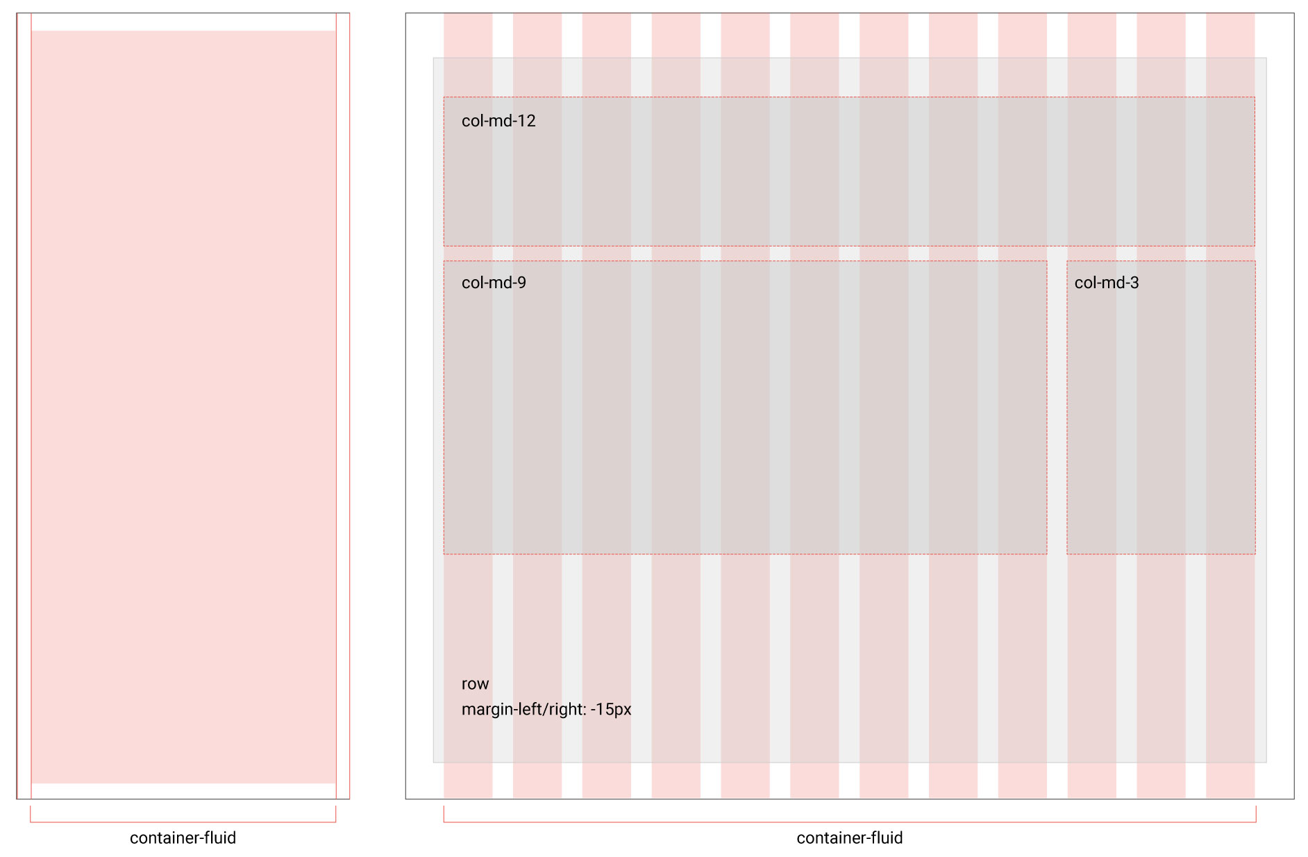
A 12 column grid sets the layout rules for all pages across all screen sizes. Topic and policy pages use a 9:3 column layout for the content and sidebar.
View full size image (JPG 148 KB) Download image (JPG 148 KB)
Responsive breakpoints
The breakpoints of the Practice Centre determine where the layout and design change to better suit various screen sizes.
- Extra small / small: less than 768px
- Medium: 768px to 991px
- Large: 992px to 1199px
- Extra large: 1200px and above
Container
The Practice Centre uses 'container-fluid' which allows for a fluid layout within these breakpoints to most efficiently use the width of the browser.